Mastering call-to-action design is crucial for any digital marketer looking to boost interaction without feeling overly aggressive. A well-crafted call to action (CTA) can mean the difference between a user engagement and a missed opportunity. In this article, we explore strategies that can help you create CTAs that are not only effective but also feel natural and inviting to your audience. By focusing on the subtleties of design and messaging, we aim to provide you with the tools you need to encourage more clicks in a way that maintains the integrity of your brand and respects your audience.
Understanding the Basics of Call-to-Action Design
Before diving into advanced tactics, it’s important to grasp the foundational elements that make a call to action effective. This includes everything from the language used to the color and shape of the button. We’ll break down these essentials to ensure your CTAs stand out.
Table of Contents
- The Importance of CTA Placement
- Color Psychology and CTA Design
- Creating Compelling CTA Copy
- Optimizing CTA Buttons for Mobile Users
- Utilizing Negative Space Around CTAs
- Leveraging Social Proof in Call-to-Action Design
- A/B Testing Your CTAs for Maximum Effectiveness
- Keeping Your CTA Up-to-Date with Design Trends
- Examples of Effective Call-to-Action Design
- Key Takeaways and Best Practices for CTA Design
Understanding the Basics of Call-to-Action Design
Before we jump into more sophisticated strategies, it’s critical to understand the core components that contribute to a successful call-to-action (CTA). An effective CTA is much more than a button on your page; it’s a crucial part of your marketing strategy that guides users towards the action you want them to take. Here, we’ll explore the foundational principles of CTA design, from the choice of words to the visual elements that catch the eye.
Key Elements of a Successful CTA:
- Visibility: Your CTA should stand out and be easily found by visitors.
- Message Clarity: Use clear, concise language that tells users exactly what to expect.
- Design Appeal: Attractive design elements draw attention and can significantly increase clicks.
- Action-Oriented: Encourage action with verbs that inspire urgency or benefit.
Integrating these elements into your call-to-action design ensures that your CTAs not only capture attention but also encourage users to take the next step.
The Importance of CTA Placement

Where you place your call-to-action can greatly impact its effectiveness. Placement should be strategic, ensuring that CTAs are both visible and intuitive for the user’s journey on your website. Let’s look at a few optimal locations:
- Above the Fold: Placing a CTA above the fold ensures it’s seen without scrolling.
- Within the Content: Embedding CTAs within relevant content can prompt action while the user is engaged.
- At the End of Content: A CTA after valuable information capitalizes on user interest at just the right time.
Remember, the goal is not just visibility but also to place CTAs in contexts that make clicking them feel like the natural next step.
Color Psychology and CTA Design
Color isn’t just an aesthetic choice—it plays a pivotal role in how users perceive and interact with your CTAs. Different colors can evoke different emotions and actions, making the choice of color a significant one in CTA design. Here are some colors and associated actions:
- Red: Urgency and excitement, often used for clearance sales.
- Green: Positive action, associated with “go” or “yes.”
- Blue: Trust and security, common for finance or tech industries.
It’s essential to choose a color that not only stands out but also aligns with the action you want users to take. The contrast with the site’s overall design is also key to making your CTA pop.
Creating Compelling CTA Copy
The words you choose for your CTA can significantly influence click-through rates. The ideal CTA copy conveys value, creates a sense of urgency, and is clear about what will happen next. Here’s how to craft CTA copy that converts:
Be Specific and Benefit-Oriented
Instead of a vague “Click Here,” use “Get Your Free E-Book Now!” This tells users exactly what they’re getting, making the CTA more appealing.
Test Various Approaches: Don’t be afraid to experiment with different phrases to see what resonates with your audience. Phrases that evoke curiosity, such as “Find Out More” or “See the Secret,” can be particularly effective.
Optimizing CTA Buttons for Mobile Users
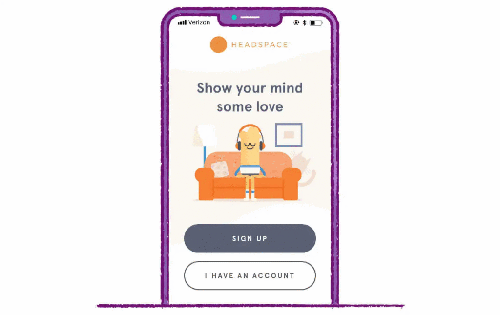
With more users than ever accessing websites via mobile devices, your CTA design must cater to this audience. Mobile optimization involves ensuring that buttons are large enough to be easily tapped with a finger and that they’re visible without excessive scrolling. Here are a few tips:
- Size Matters: A button size of 44px by 44px is generally recommended for optimal finger tapping.
- Contrast is Key: Ensure your CTA button contrasts with background elements, even on smaller screens.
- Simplify Navigation: Mobile users should be able to navigate to your CTA easily, without confusion.
Optimizing for mobile is not just a matter of resizing buttons; it’s about rethinking how users interact with your CTAs on smaller screens. This consideration is crucial for improving engagement rates across all device types.
Utilizing Negative Space Around CTAs
Negative space, or the area around and between elements on a page, is a powerful tool in CTA design. It helps to draw the eye directly to your button or link, making it more likely to be noticed and clicked. Here’s why negative space is your ally:
By providing a “breathing room” around your CTA, you reduce clutter and emphasize the action you want users to take. Think of negative space as a spotlight pointing directly at your call-to-action. Incorporating ample negative space in your design can dramatically increase the effectiveness of your CTAs, making them stand out in a busy digital landscape.
Leveraging Social Proof in Call-to-Action Design
Incorporating social proof into your CTA design can significantly enhance its effectiveness. When potential customers see that others have taken the action you’re prompting and benefited from it, they’re much more likely to do the same. Here are a few ways to integrate social proof:
- Testimonials next to your CTA
- Counters showing how many people have already signed up or purchased
- Badges of awards or certifications
Remember, the key to effective social proof is authenticity. Make sure the testimonials or numbers you display are real and verifiable.
A/B Testing Your CTAs for Maximum Effectiveness
The only way to truly know what works best for your audience is through testing. A/B testing, also known as split testing, involves comparing two versions of a CTA to see which one performs better. This process can provide valuable insights into the preferences and behaviors of your audience.
To conduct a meaningful A/B test:
- Change one element at a time (e.g., color, placement, wording) to know what influences the outcome.
- Use a significant sample size to ensure your results are statistically reliable.
- Analyze your test results to make informed decisions about future CTA designs.
Continuous testing and optimization based on data can significantly improve the effectiveness of your CTAs over time.
Keeping Your CTA Up-to-Date with Design Trends

Design trends evolve, and so should your CTAs. Staying current can make your calls-to-action more attractive and effective. This doesn’t mean chasing every trend but rather keeping your CTAs looking modern and engaging. Some current trends include:
- Minimalist designs with plenty of white space
- Vibrant, bold colors that pop
- Interactive elements like hover effects
However, always prioritize clarity and functionality over trendiness. The best CTA is one that effortlessly guides users towards the desired action.
Examples of Effective Call-to-Action Design
Let’s take inspiration from successful CTAs:
Dropbox: Uses a clear, benefit-oriented CTA “Get Started” alongside minimalist design elements.
Netflix: Features a prominent “Join Free for a Month” CTA, making an irresistible offer with straightforward copy.
These examples show how simplicity combined with compelling offers can drive users to take action.
Key Takeaways and Best Practices for CTA Design
Creating effective CTAs is both an art and a science. As we’ve seen, several factors contribute to a high-performing call-to-action, from its design and placement to the copy and colors used. Here are some final tips to remember:
Focus on the User Experience
Every element of your CTA should add value and make the desired action clear and simple for the user.
Keep Testing and Optimizing
There’s always room for improvement. Regular testing and updates can help you keep your CTAs effective and engaging.
By incorporating these strategies into your call-to-action design, you can significantly enhance user engagement and conversion rates without coming off as pushy. Remember, the goal of a CTA is to guide and encourage, not to force. With the right approach, you can create CTAs that are both persuasive and pleasant, leading to better results for your digital marketing efforts.

Hello, I am Sajid, I have been working & writing for the Gibson team for over 4-years now. I help with keyword research, meta data insertion, content creation, and getting the project to the finish line. I also manage, organize, and publish helpful articles.