
Understanding visual hierarchy is key in design and can dramatically improve the way users interact with your content. This fundamental concept ensures your message isn’t just seen but is also understood instantly and effectively. By mastering visual hierarchy, you can guide your audience’s attention to the most critical parts of your message, making your design not just a treat for the eyes but also a powerful tool for communication.
Visual Hierarchy – The Foundation of Effective Design
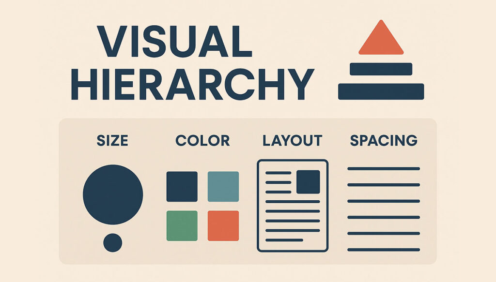
Visual hierarchy refers to the arrangement or presentation of elements in a way that implies importance. This technique uses principles like size, color, contrast, alignment, repetition, and proximity to organize content in a way that leads the viewer’s eye through a path of discovering information, prioritizing it from most important to least important. When done right, visual hierarchy makes designs intuitive, ensuring users “get” your message without a struggle.
Table of Contents
- Understanding Visual Hierarchy
- Why Visual Hierarchy is Crucial
- Elements of Visual Hierarchy
- Principles of Visual Hierarchy
- Applying Visual Hierarchy in Design
- Visual Hierarchy in Web Design
- Tips for Creating Effective Visual Hierarchy
- Examples of Visual Hierarchy
- Visual Hierarchy and User Experience
- The Future of Visual Hierarchy
- Conclusion: Why Visual Hierarchy Matters
Understanding Visual Hierarchy

At its core, visual hierarchy influences the order in which the human eye perceives what it sees. This is not by chance but by design. Designers leverage visual hierarchy to steer viewers’ attention to areas of importance swiftly. The goal is making sure the key messages stand out. Think of visual hierarchy as the guide that leads the viewer through the content in a predetermined sequence, enhancing the understanding and retention of information.
Why Visual Hierarchy is Crucial
Why does visual hierarchy take center stage when we talk about effective design? The answer lies in its impact on usability and user experience. A strong visual hierarchy:
- Grabs attention: It captures the viewer’s eye and makes the first impression count.
- Organizes content: It structures information making it easier to navigate and understand.
- Improves comprehension: By emphasizing key points, it guides users to your message faster.
- Enhances aesthetics: It makes designs more pleasing to the eye, contributing to a positive user experience.
Elements of Visual Hierarchy
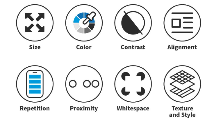
Several elements play pivotal roles in establishing a visual hierarchy. Mastery of these elements allows designers to create compelling designs that stand out. These elements include:
- Size – Larger elements capture attention faster than smaller ones.
- Color – Bright colors tend to draw the eye more than muted tones.
- Contrast – High contrast between elements can make them stand out.
- Alignment – Proper alignment can create order and group elements.
- Repetition – Repeating styles can emphasize their importance or show a connection.
- Proximity – Items placed closer together are perceived as related.
Principles of Visual Hierarchy
Understanding the principles behind visual hierarchy can help create designs that not only look good but also communicate effectively. These principles include:
Scalability
The use of scale to denote importance is a classic principle. Larger elements are immediately seen as more significant. This hierarchy of scale can guide the viewer’s attention to where it’s most needed first.
Contrast
Contrast is not just about colors; it encompasses contrasts in shapes, sizes, textures, and even typography. A contrasting element within a homogeneous group will always stand out and grab attention.
Balancing Elements
Creating a balance between different elements ensures that no single part of the design overwhelms others. It keeps the viewer’s eyes moving smoothly across the design.
Applying Visual Hierarchy in Design

How do you apply visual hierarchy in real-world design projects? Here are some impactful ways:
1. Start with a goal: Understand what you want your users to see and do. Is it to notice a “Buy Now” button, read a blog post, or focus on a product image? Your design should lead them to these goals naturally.
2. Use size to your advantage: The most crucial elements should be the largest. Whether it’s a headline, a call-to-action (CTA) button, or an image, make sure it’s seen first.
3. Incorporate contrast: Use contrast to make essential information stand out. Playing with different colors or font weights can make a significant difference.
4. Pay attention to alignment: Keep your design clean and organized through alignment. This makes your content more readable and visually appealing.
5. Experiment with spacing: Spacing, including margins and paddings, can significantly influence how content is perceived. Use it to group items or signify importance.
Visual Hierarchy in Web Design
In the realm of web design, visual hierarchy is perhaps even more critical. The average website visitor decides within seconds whether to stay or leave. Here’s how visual hierarchy can make a difference:
Navigational simplicity: A well-structured website guides users effortlessly to the information they seek, using design elements to lead the way.
Content prioritization: By emphasizing key content, you ensure that your message is communicated effectively. This might mean highlighting new products, important announcements, or calls to action.
Fostering engagement: A website designed with visual hierarchy in mind is more likely to engage visitors, encouraging them to explore more content, interact with elements, and eventually convert.
Visual hierarchy is not just about making sites look good. It’s about creating a seamless user experience that communicates clearly and persuasively, ensuring your website fulfills its purpose effectively.
Tips for Creating Effective Visual Hierarchy
Creating an effective visual hierarchy requires more than just understanding its principles. Here are actionable tips to help you apply these concepts:
- Play with typography: Different fonts and weights can create a dynamic visual experience that guides the reader’s eye.
- Embrace whitespace: Sometimes, what you don’t include is as important as what you do. Whitespace can help to break up content and allow the eye to rest.
- Consider the Z-Pattern: In Western cultures, eyes naturally follow a Z-pattern across the page. Place your most important content along this path.
- Use imagery wisely: Images can draw attention and evoke emotion, making them powerful tools for creating a hierarchy.
Examples of Visual Hierarchy
To truly grasp the impact of visual hierarchy, let’s examine some real-world examples:
Magazines: Headlines are typically bold and large, subheadings are smaller, and body text is smaller still. This guides the reader naturally through the content.
Websites: Homepages often feature a large, eye-catching banner or hero image, with a clearly defined navigation menu and highlighted calls-to-action.
Advertisements: The most successful ads use visual hierarchy to ensure the main message and brand name/logo are immediately visible.
These examples show that no matter the medium, visual hierarchy directs the viewer’s attention to the most crucial elements first.
Visual Hierarchy and User Experience

A strong visual hierarchy isn’t just about aesthetics; it’s fundamental to creating a positive user experience (UX). When users can easily find what they’re looking for, they’re more likely to stay engaged and take desired actions. Conversely, a poor visual hierarchy can lead to confusion, frustration, and a higher bounce rate. Thus, UX designers rely on visual hierarchy to create interfaces that are intuitive and user-friendly.
The Future of Visual Hierarchy
As digital mediums evolve, so too does the art of creating a visual hierarchy. Emerging technologies, like virtual reality (VR) and augmented reality (AR), present new challenges and opportunities for designers. In these immersive environments, visual hierarchy will play a crucial role in guiding user interaction and ensuring a seamless experience. Additionally, the rise of voice interfaces and machine learning will require designers to rethink traditional approaches to visual hierarchy.
Conclusion: Why Visual Hierarchy Matters
In conclusion, visual hierarchy is a fundamental aspect of design that significantly affects user experience and engagement. By carefully arranging visual elements according to their importance, designers can guide users’ attention, encourage actions, and communicate messages more effectively. Whether you are designing a website, an ad, or any visual content, prioritizing visual hierarchy can help ensure your message is not just seen, but understood and remembered. Embrace the principles and tips shared in this article to unlock the power of visual hierarchy and make your design projects more intuitive and impactful.
Remember, visual hierarchy is not a static concept but one that evolves with design trends and user expectations. Keep experimenting, learning, and applying these techniques to stay ahead in the dynamic field of design.

Hello, I am Sajid, I have been working & writing for the Gibson team for over 4-years now. I help with keyword research, meta data insertion, content creation, and getting the project to the finish line. I also manage, organize, and publish helpful articles.