
Design mistakes can be the silent assassins of website conversions, often lurking unnoticed while undermining your efforts to engage and convert visitors. Recognizing and rectifying these errors is crucial for enhancing your site’s effectiveness and maximizing conversion rates. This article dives into common design pitfalls and offers actionable insights to help you steer clear of them, ensuring your website not only attracts but also retains and converts your target audience.
Design Mistakes That Quietly Kill Your Conversions
It’s easy to underestimate the impact of design on your website’s conversion rates. However, even small mistakes can have big consequences, turning potential leads away before they’ve even explored what you have to offer. We’ll explore how to identify these issues and the steps you can take to correct them, paving the way for smoother user experiences and, ultimately, higher conversions.
Table of Contents
- Understanding the Basics of Conversion-Centric Design
- How Complicated Navigation Systems Push Your Visitors Away
- Ignoring Mobile Responsiveness: A Critical Design Mistake
- Overloading Your Site With Elements and How It Affects Conversions
- Neglecting Website Speed and Its Impact on User Experience
- The Downside of Using Generic Stock Photos
- Overlooking Color Schemes and Fonts: Minor Choices with Major Effects
- Missing a Clear Call to Action: Why It’s a Deal Breaker
- Poor Form Design and Placement: Barriers to Conversion
- Forgetting About the Power of Testimonials and Social Proof
- Neglecting Accessibility: How Inclusivity Impacts Conversions
- Final Thoughts on Avoiding Design Mistakes That Kill Conversions
Understanding the Basics of Conversion-Centric Design
In the realm of digital marketing, every element on your website serves a purpose. From colors to layout and typography, each component plays a part in guiding visitors towards making a conversion. The foundation of conversion-centric design lies in **understanding user behavior**. This approach ensures that your website is not just visually appealing but also intuitive and user-friendly.
A well-designed website *encourages engagement*, making visitors more likely to take the desired action, whether it’s signing up for a newsletter, making a purchase, or contacting your business. To achieve this, focus on clarity, simplicity, and emphasizing key elements that can drive conversions.
Key Principles to Remember:
- Clarity: Ensure your message is clear and straightforward.
- Consistency: Keep your design elements consistent across all pages.
- Call to Action (CTA): Make your CTAs prominent and persuasive.
- Navigation: Ensure your site is easy to navigate, making it simple for users to find what they’re looking for.
How Complicated Navigation Systems Push Your Visitors Away
One of the quickest ways to frustrate visitors and drive them away is through a complicated navigation system. Websites that lack intuitive navigation create an unsatisfactory user experience, significantly affecting your site’s ability to convert traffic into leads or sales.
Here’s a startling fact: According to various studies, nearly 50% of visitors use the navigation menu to orient themselves when they first arrive at a website. If they can’t figure out how to navigate your site within seconds, you’ve likely lost them for good.
Fixing Navigation Issues
To improve your website’s navigation:
- Simplify your menu: Limit the number of options to avoid overwhelming users.
- Use clear labels: Choose menu labels that accurately describe the content they lead to.
- Implement a logical structure: Organize your menu in a way that flows naturally from general to specific.
Ignoring Mobile Responsiveness: A Critical Design Mistake

In an era where more than half of all web traffic comes from mobile devices, ignoring mobile responsiveness can be a fatal mistake for your website’s conversion rate. A website that isn’t optimized for mobile use is likely to provide a poor user experience, leading to increased bounce rates and missed conversion opportunities.
A responsive design adapts to the screen size of the device it’s being viewed on, ensuring that your website is accessible and user-friendly, regardless of how someone is accessing it. Making your website mobile-friendly is no longer optional; it’s a necessity.
Quick Tip: Use Google’s Mobile-Friendly Test tool to check if your website meets the criteria for mobile responsiveness.
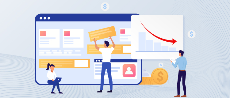
Overloading Your Site With Elements and How It Affects Conversions
Less is often more when it comes to website design. Overloading your site with too many elements — whether it’s excessive text, images, or animations — can overwhelm visitors and detract from your primary conversion goals. A cluttered website not only looks unprofessional but also significantly affects load time and user experience.
The key is to balance aesthetics with functionality. Every element on your page should serve a clear purpose. By decluttering your site and focusing on a minimalist approach, you can improve both its appearance and performance.
Streamlining Your Design
To effectively streamline your website design:
- Identify and remove any unnecessary elements.
- Focus on a clean layout with ample white space to enhance readability.
- Emphasize clear, concise messaging.
Remember, a streamlined site not only loads faster but also makes it easier for visitors to find what they’re looking for, thereby increasing the likelihood of conversion.
Neglecting Website Speed and Its Impact on User Experience
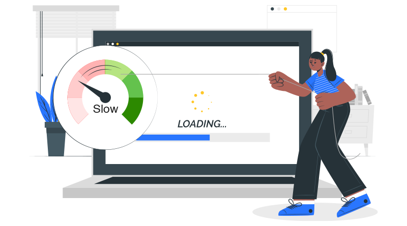
Website speed is a crucial factor for both SEO and user experience. A slow-loading website can frustrate visitors, encouraging them to leave before they’ve even had a chance to interact with your content. In fact, studies have found that a 1-second delay in page load time can lead to a 7% reduction in conversions.
Improving your website’s speed involves optimizing images, leveraging browser caching, and minimizing the use of heavy plugins or scripts that can slow down load times. Fast-loading sites not only improve user experience but also rank better in search engine results, driving more traffic and potential conversions to your site.
Testing your website’s speed with tools like Google PageSpeed Insights can provide valuable insights and recommendations for enhancements. Investing the time to make these adjustments can pay off significantly in terms of site performance and user satisfaction.
Using Generic Stock Photos
While visuals are crucial in website design, relying too heavily on generic stock photos can make your site feel impersonal and disingenuous. Authentic, high-quality images not only improve aesthetics but also help in building trust and connection with your audience. Custom photography might be more of an investment, but it pays dividends in establishing a unique brand identity and enhancing user engagement.
Tip: If custom photography isn’t an option, opt for less common stock images and consider editing them to fit your brand’s style and color palette.
Overlooking Color Schemes and Fonts: Minor Choices with Major Effects
The colors and fonts you choose do more than just decorate your site; they convey your brand’s message and values. Inconsistent color schemes and hard-to-read fonts can confuse and deter visitors. It’s essential to select colors and fonts that align with your brand and improve readability.
Remember: Color psychology can significantly impact how your brand is perceived. For example, blue often instills a sense of trust and dependability, which is why it’s a popular choice for banks and social media platforms.
Choosing the Right Colors and Fonts
To ensure your choices support rather than detract from your goals:
- Pick a color scheme that reflects your brand’s persona and message.
- Choose fonts that are easy to read across devices and sizes.
- Use a limited number of fonts to maintain a cohesive look.
Missing a Clear Call to Action: Why It’s a Deal Breaker
A clear call to action (CTA) is critical in guiding users toward conversion. Without it, even the most engaged visitor may be unsure of the next steps. Your CTA should stand out and convey exactly what you want the user to do, whether it’s to “Buy Now,” “Sign Up,” or “Learn More.” Effective CTAs are concise, prominently placed, and imbued with a sense of urgency or benefit.
Quick fix: Review your site to ensure every page has a CTA that’s easy to find and understand.
Poor Form Design and Placement: Barriers to Conversion
Online forms are often the final step before conversion, yet many websites suffer from poor form design and placement, deterring potential leads. To optimize forms for conversions, keep them short, ask for only essential information, and consider their placement carefully. A form that’s easy to complete and placed in a natural and visible spot on your webpage will increase the likelihood of submission.
Pro tip: Use A/B testing to determine the most effective form design and placement for your audience.
Forgetting About the Power of Testimonials and Social Proof
Testimonials and other forms of social proof are invaluable in building trust with your website visitors. Highlighting positive reviews and success stories can significantly influence decision-making by proving the value of your products or services. Ensure these elements are prominently featured on your site, ideally on the homepage or product pages, to boost credibility and conversions.
Action Item: Collect and display testimonials where they’ll have the most impact, using authentic feedback to underscore your offerings’ value.
Neglecting Accessibility: How Inclusivity Impacts Conversions
Website accessibility is not just a legal requirement in many jurisdictions; it’s a moral obligation and a wise business strategy. Ensuring your website can be navigated and understood by everyone, including those with disabilities, expands your potential audience and improves user experience across the board.
Steps to Improvement: Employ alt text for images, use clear, legible fonts, and ensure your site is navigable with a keyboard alone. These changes not only benefit users with disabilities but also improve the overall user experience.
Final Thoughts on Avoiding Design Mistakes That Kill Conversions
Understanding and addressing these common design mistakes can have a profound impact on your website’s ability to convert visitors into customers. Each element of your website, from navigation and responsiveness to imagery and CTAs, plays a pivotal role in guiding user behavior.
By focusing on a user-centric design principle, regularly testing and updating your site, and adhering to best practices in accessibility and usability, you can enhance your website’s performance and conversion rate. Remember, in the digital world, first impressions matter, and your website is often the first point of contact between your business and potential customers. Make it count.

Hello, I am Sajid, I have been working & writing for the Gibson team for over 4-years now. I help with keyword research, meta data insertion, content creation, and getting the project to the finish line. I also manage, organize, and publish helpful articles.